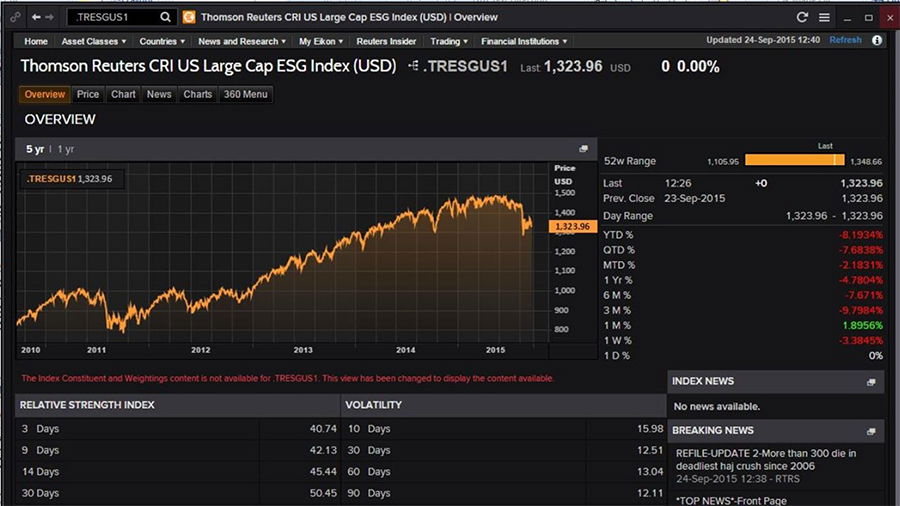
Dashboard Design

Project Overview:The NYSE Dashboard is a central platform for financial professionals and shareholders to track stock market activities, monitor stocks, and access financial data. The platform plays a pivotal role in keeping users informed about market trends and making critical investment decisions.
My Role:
- Design Analyst: Responsible for analyzing existing design, identifying areas of improvement, and proposing design enhancements.
- UX Researcher: Conducts interviews with bankers, stock brokers, and shareholders to collect valuable insights and understand user pain points.
Research Phase:
- User Interviews:
- Conducted interviews with bankers, stock brokers, and shareholders to understand their workflow, information needs, and frustrations with the current NYSE Dashboard.
- Data Analysis:
- Analyzed interview data to identify common pain points, usability issues, and desired features.
Key Findings:
- Information Overload:
- Users reported feeling overwhelmed by the sheer volume of data and the complexity of the dashboard, hindering their ability to make quick decisions.
- Inefficient Navigation:
- Navigation was a common pain point, with users struggling to find specific stocks, news, and financial information. They also reported difficulties in customizing their view.
- Data Visualization:
- Users expressed a need for improved data visualization, with a focus on clear, concise, and customizable charts and graphs.
- Personalization:
- Shareholders wanted the ability to personalize their dashboard to reflect their specific investments and interests.
Proposed Solutions:
- Streamlined Information Presentation:
- Simplify data presentation to reduce information overload, offering users a cleaner, more intuitive view.
- Improved Navigation:
- Enhance navigation by reorganizing menu items, offering a customizable layout, and implementing quick access shortcuts to key features.
- Enhanced Data Visualization:
- Implement customizable, interactive charts and graphs for better data comprehension. Include tooltips, filtering options, and comparison tools.
- Personalization Options:
- Allow users to personalize their dashboard by selecting stocks of interest, displaying relevant news, and customizing their view of the stock market.
Expected Results:
- A user-friendly NYSE Dashboard that effectively conveys critical information without overwhelming users.
- Improved navigation, ensuring users can access data and features more efficiently.
- Enhanced data visualization, aiding users in understanding complex financial data.
- A personalized experience for shareholders, offering content relevant to their investments.
Conclusion:The proposed improvements for the NYSE Dashboard, based on user interviews with bankers, stock brokers, and shareholders, aim to address common pain points and elevate the user experience for all users. The project aligns with the goal of providing a user-centric platform that empowers financial professionals and shareholders to make informed decisions in the stock market.