U.S. Department of Education - Design Refresh Case Study
Overview of your project and its circumstances
The US Department of Education, a nonprofit organization, is actively seeking to enhance the user experience of its website. This endeavor involves refining navigation, optimizing content placement, and incorporating visually appealing graphics. The goal is to develop a responsive and user-friendly design catering to the needs of the average user, achieved through a comprehensive understanding of diverse user personas and journeys, as well as through the execution of thorough user research and the analysis of problem statements.
Problem Statement
The current website features an abundance of content but lacks a sufficient number of navigational points and links. Furthermore, it lacks a proper responsive design and does not incorporate visual or contextual images that could provide added value and align with heuristic principles.
Solution
Employing a robust user research approach, we have crafted an alternative design for the home page, optimized for both desktop and mobile platforms.Upon conducting user reviews, we identified several limitations and generated enhancement proposals. It is apparent that the website requires an enhanced navigation system, impactful infographics, and an improved responsive design to streamline access to the right information with fewer clicks.Our expected result is a user-friendly, intuitive homepage featuring a clearly defined navigation structure, adhering to LATCH and Atomic design principles, ensuring easy accessibility and a seamless user experience.
Tools | Team | My Role | Timeline | |
|
|
|
|
My Design Process
- Define exactly what needs to be created, and why
- Research: Conduct research to gain a deep understanding of their users and their needs.
- Analysis & Planning: Collect all of the information gathered during the research stage and start to plan out how to meet those needs
- Design: Start sketching out some ideas showing the flow based on the suer journeys and personas on how to interact with the interface
- Prototyping: Getting closer to solution by converting the sketches into wireframes and prototypes to provide a shape to the solution digitally
- Testing the prototype: It is important to test the interface with real users. Usability testing helps identify any areas that need improvement before the final product goes live, and delivers this feedback from the user's point of view.
Screenshots
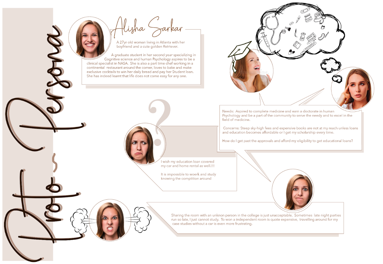
Proto-Persona - The discovery!
User Journey
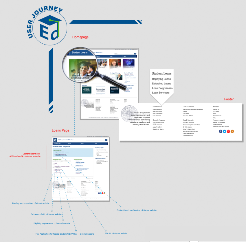 More details click here (External link)
Flow Chart
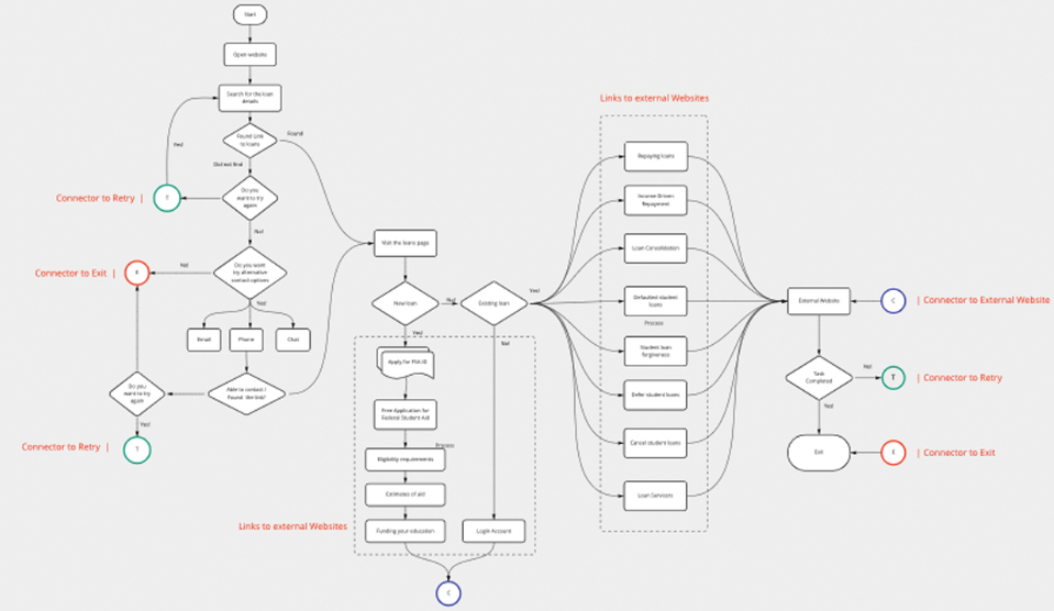
More details click here (External link)
Wireflow diagram
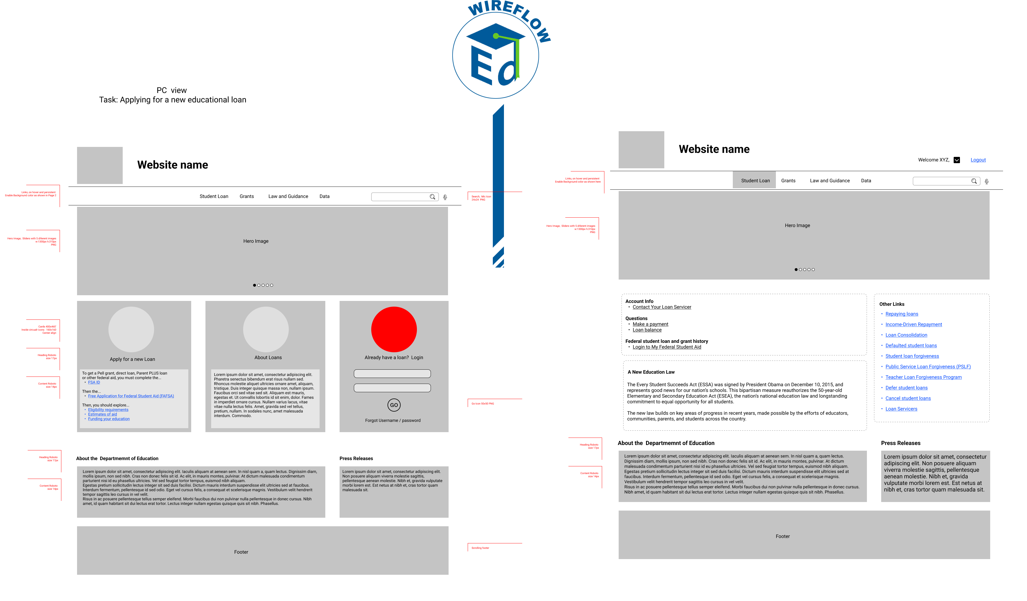
Mobile view
Task: Applying for a new educational loan
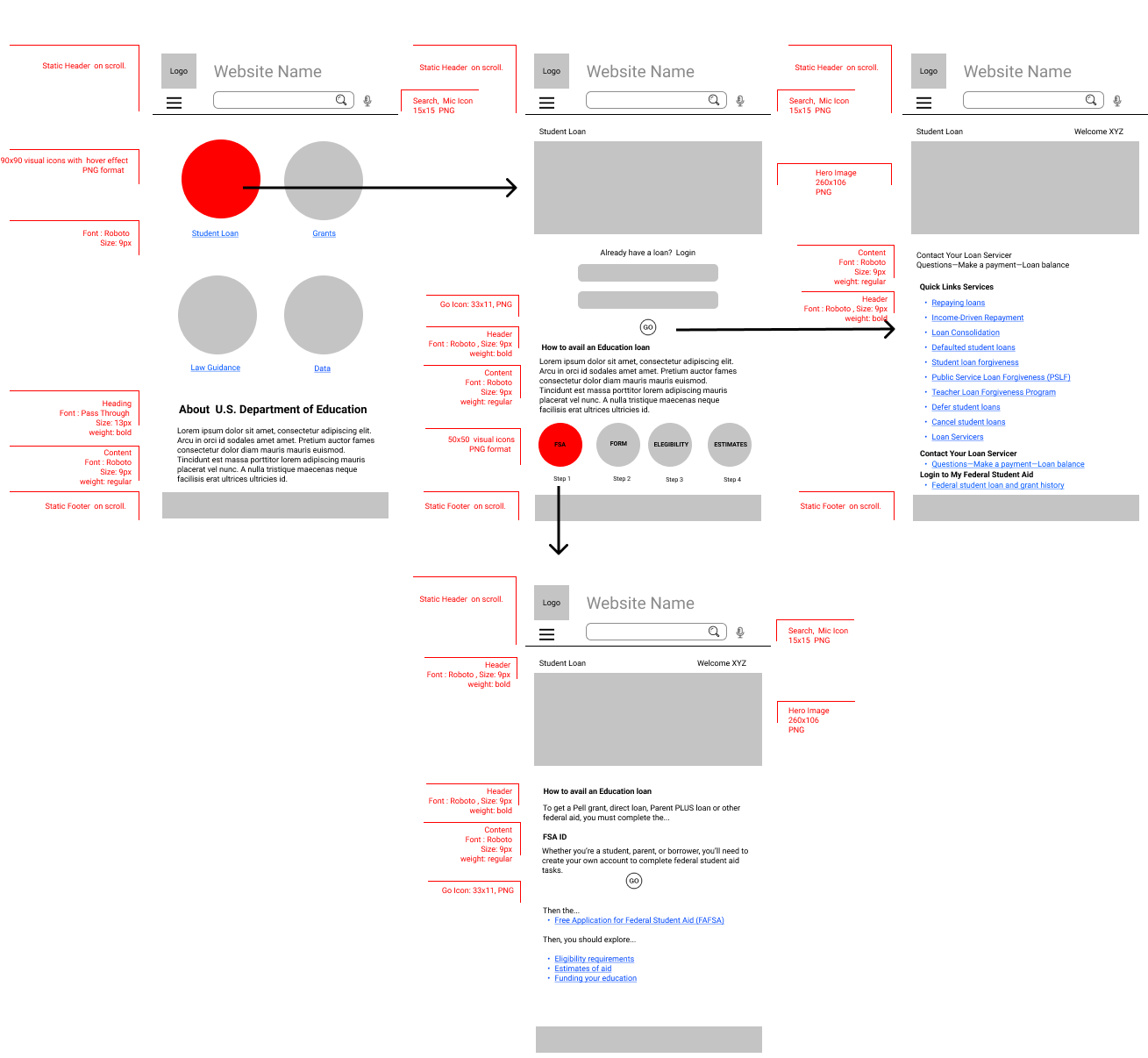
Heuristic Evaluations and Color guidelines for Accessibility and Red lining
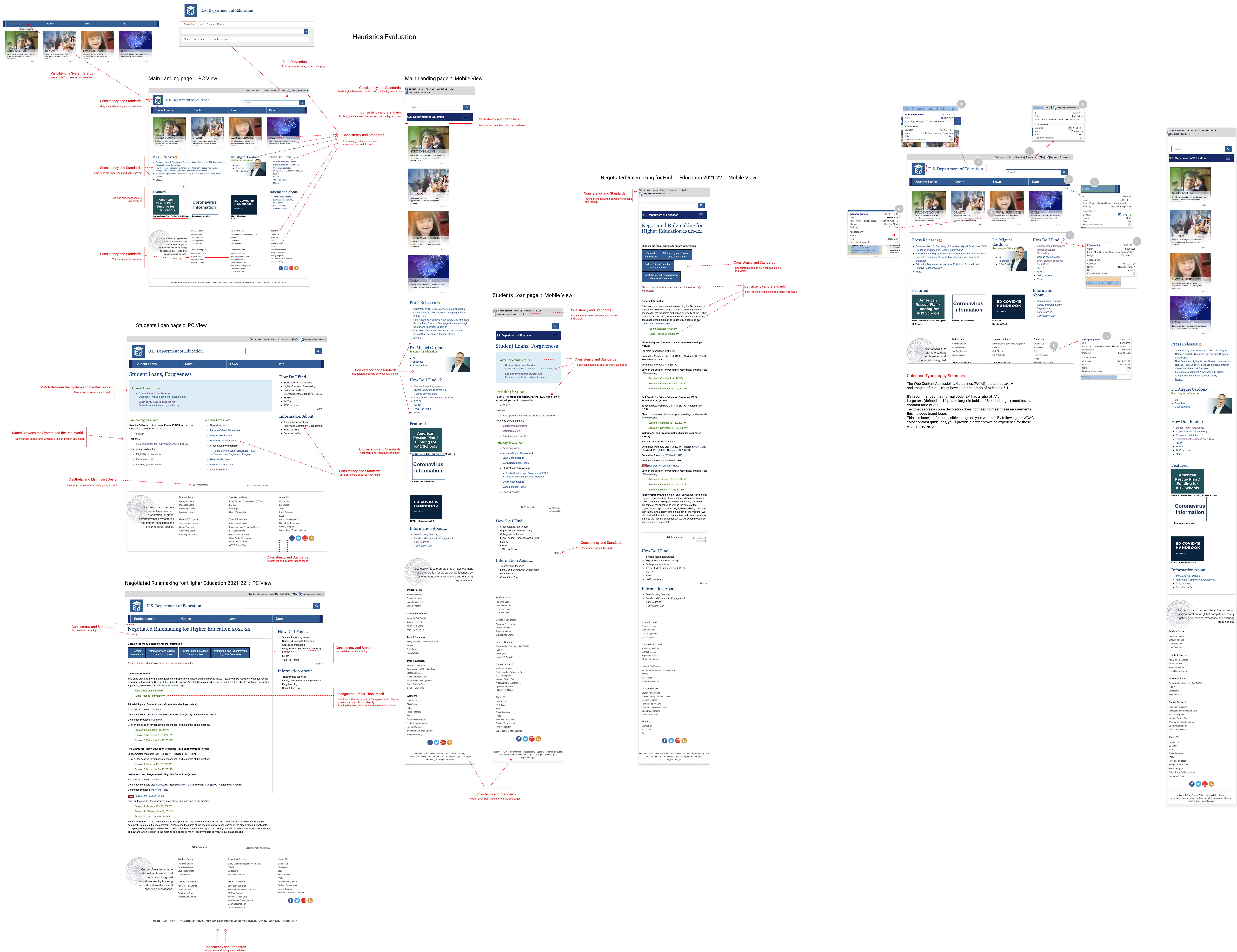
Color and Typography Summary
- The Web Content Accessibility Guidelines (WCAG) state that text and images of text must have a contrast ratio of at least 4.5:1.
- It is recommended that normal body text has a ratio of 7:1.. Large text (defined as 14 pt and larger in bold, or 18 pt and larger) must have a
contrast ratio of 3:1. - Text that serves as pure decoration does not need to meet these requirements this includes brand logos.
- This is a baseline for accessible design on your website. By following the WCAG color contrast guidelines, you’ll provide a better browsing experience for those with limited vision.
Usability tests of existing government and 2x2 Prioritization Matrices to Inform UX Decisions
User testing evaluation / summary
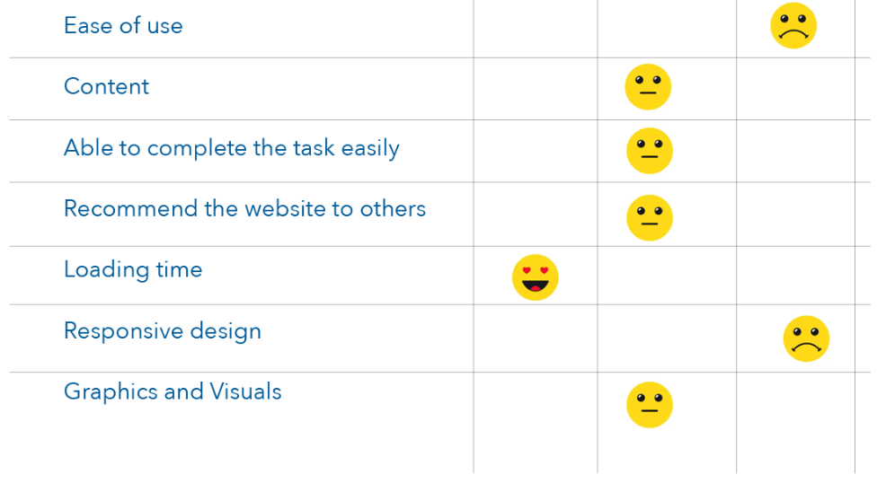
PriorityMatrix
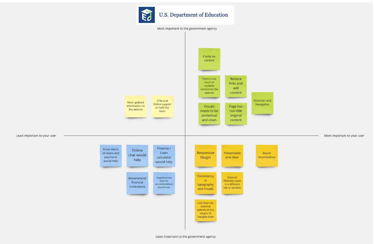
Annotated usability and heuristic issues for 5 web pages from government site (Desktop / Mobile)

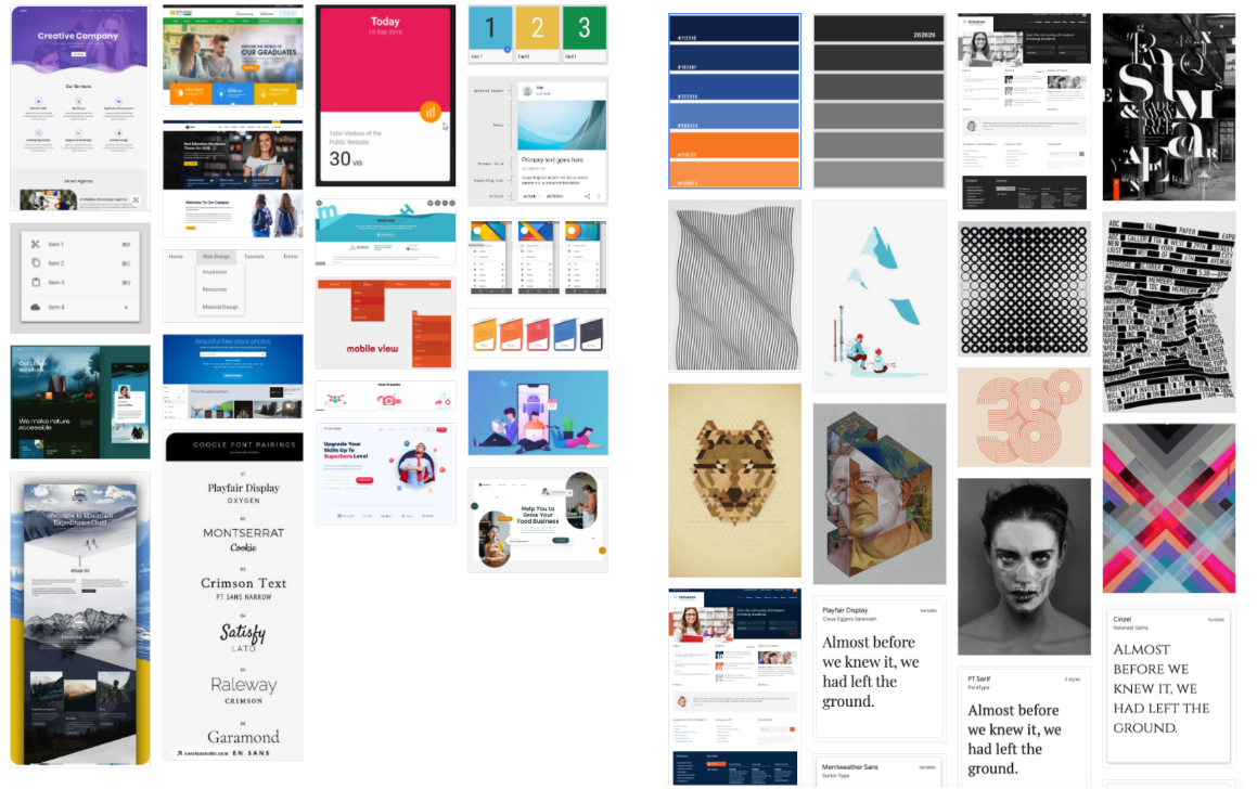
Ui Mood Board Idea wagon
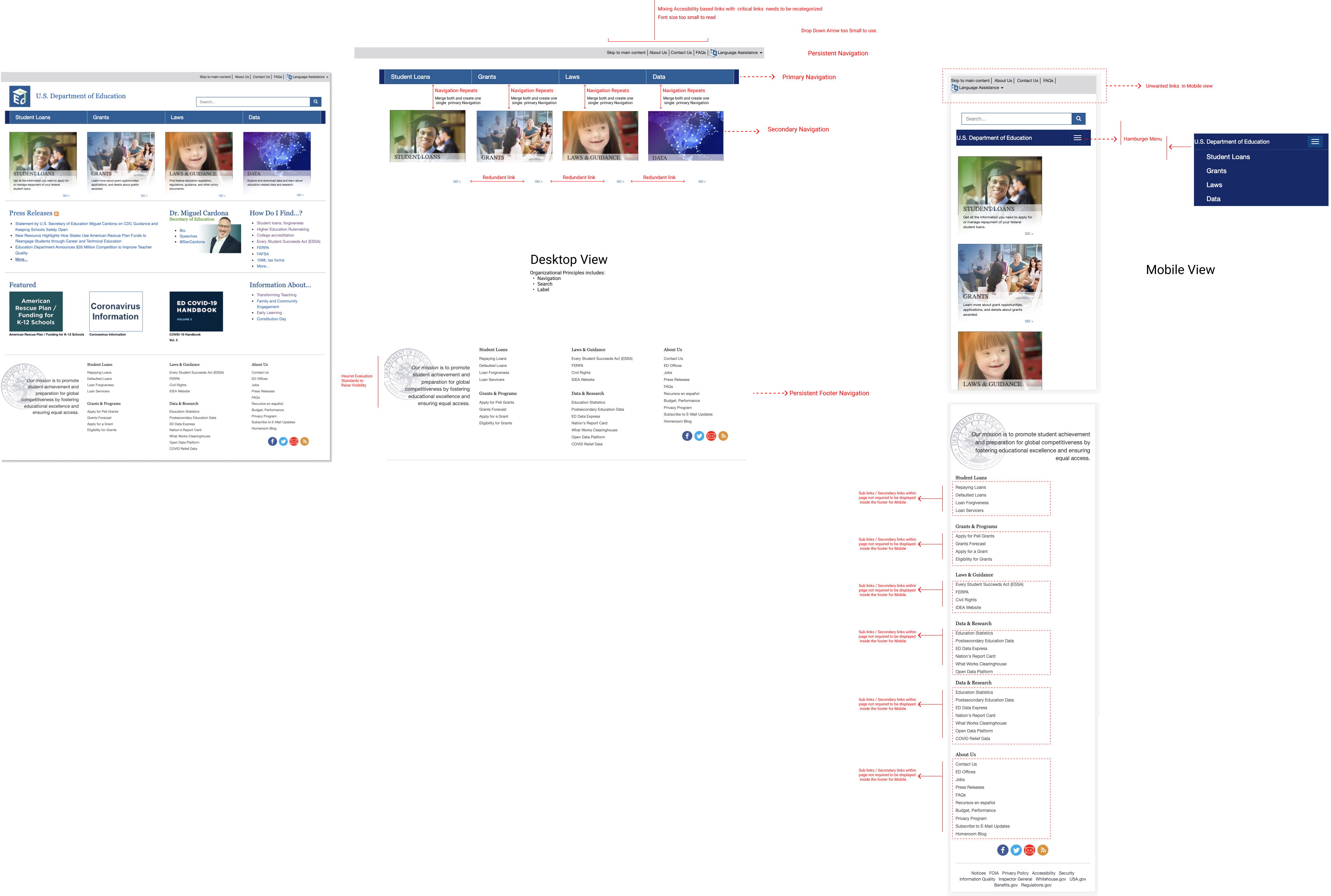
IA and UI Navigation Prototype
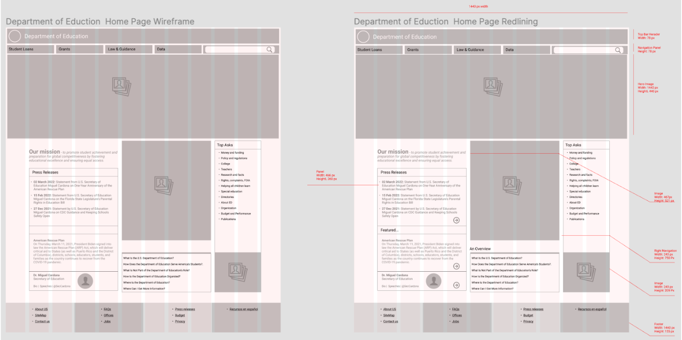
Redline and annotate the image(s), describing why the navigation should be redesigned in your opinion
Explain why you want to redesign the navigation.Explain what you think needs redesigning and why.
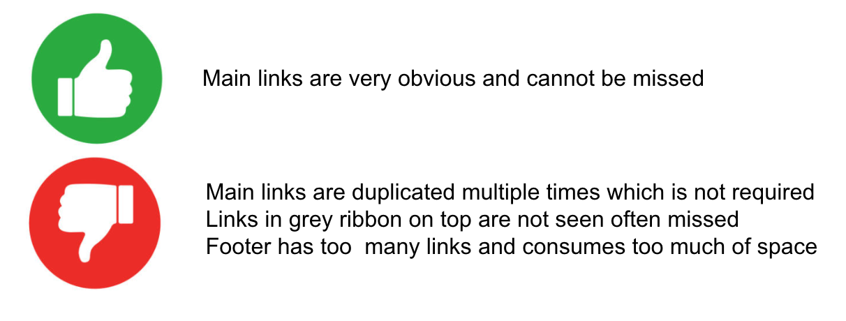
Navigation Usability test and review: 13 users Interviewed. Most common observation as below.
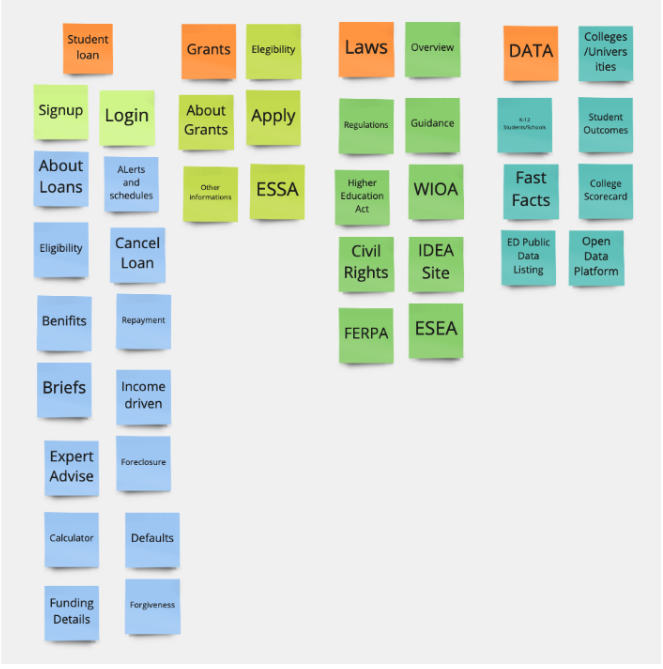
Card sorting - Define

Group:
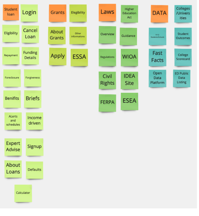
Structure
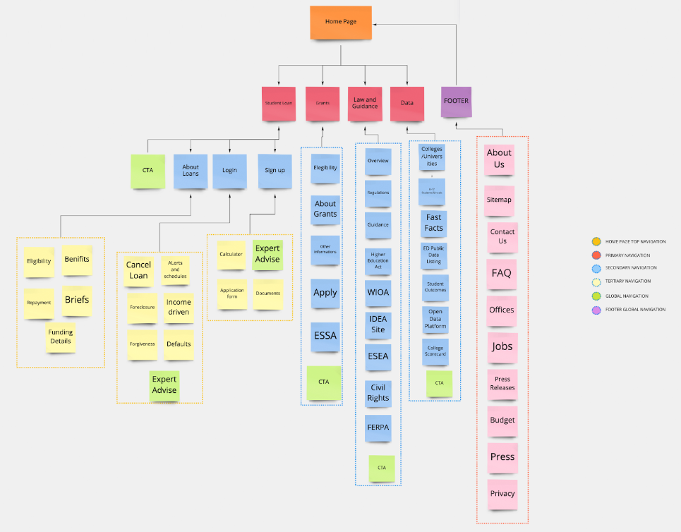
Sitemap
Navigation UI Redesign based on the new sitemap
Desktop
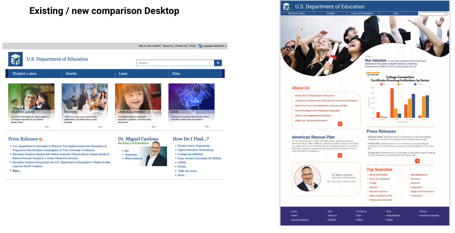
Existing
 New
New

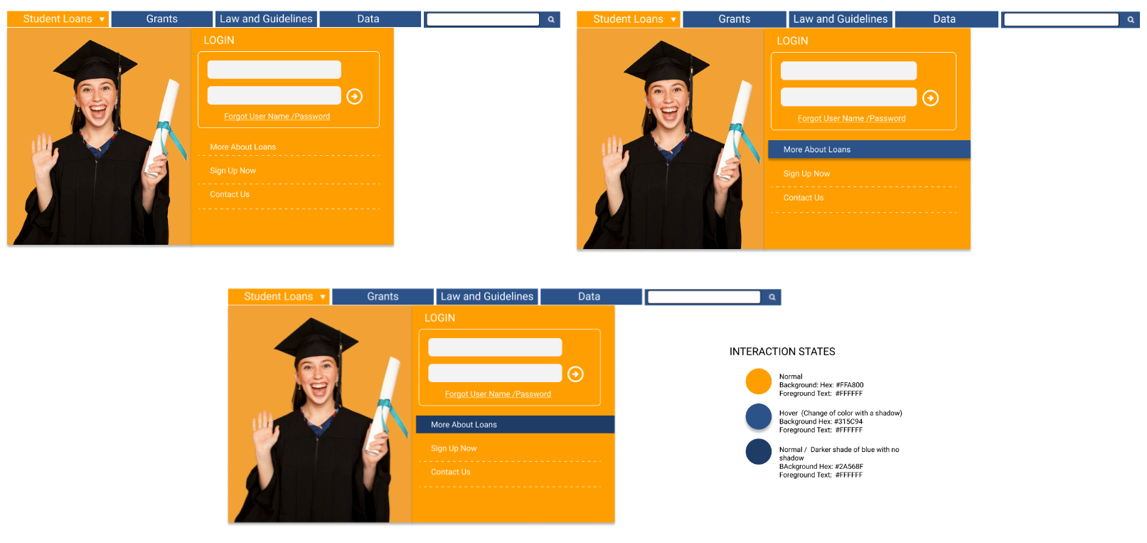
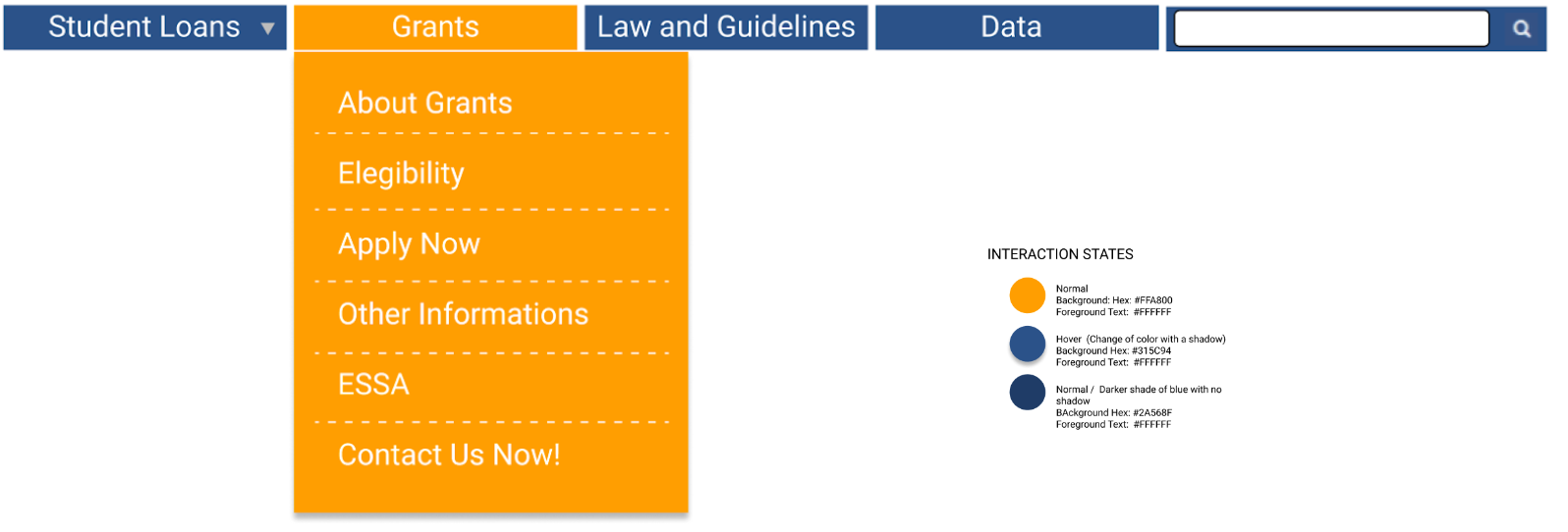
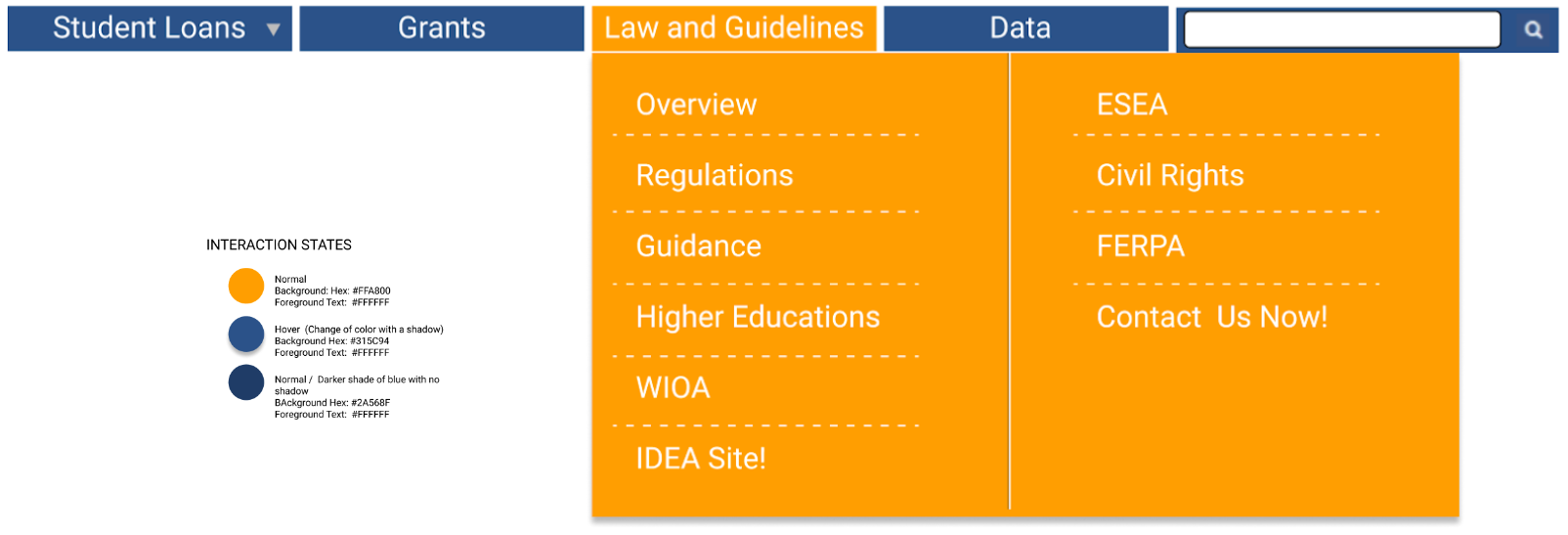
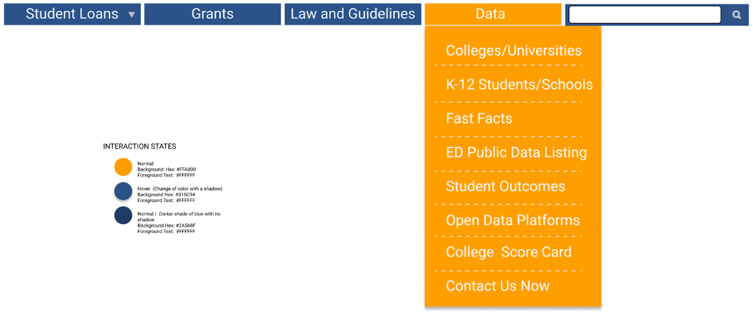
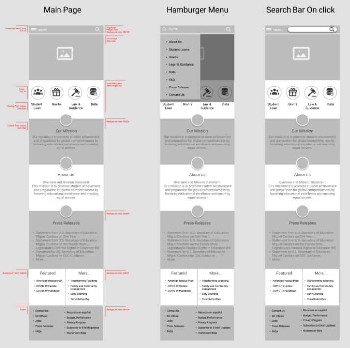
Mobile Nav
Before and After
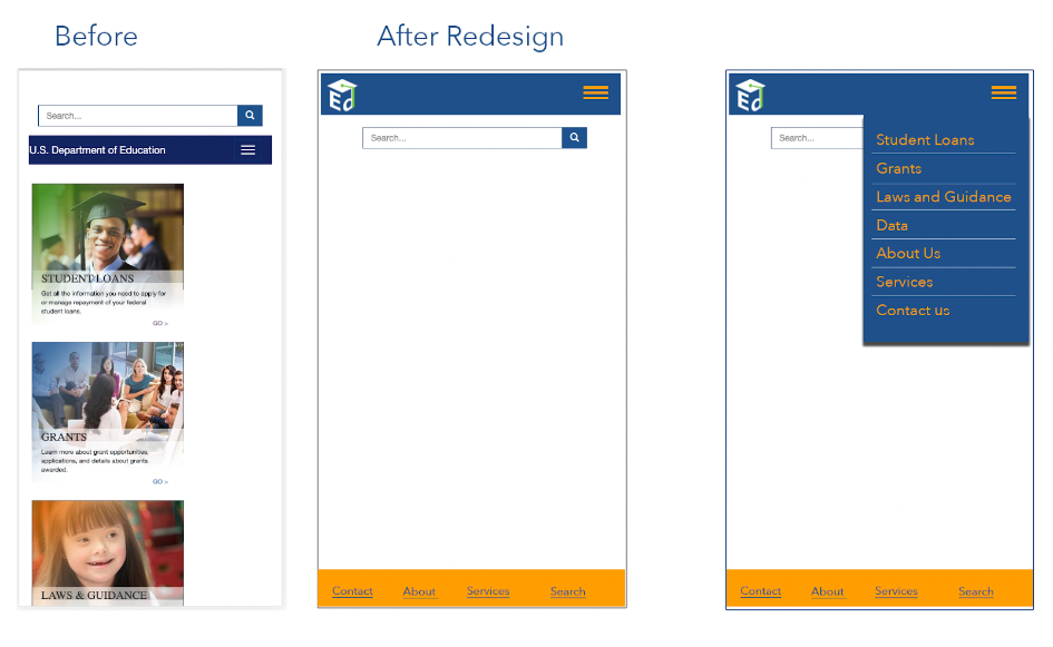
Desktop Homepage navigation wireframe UI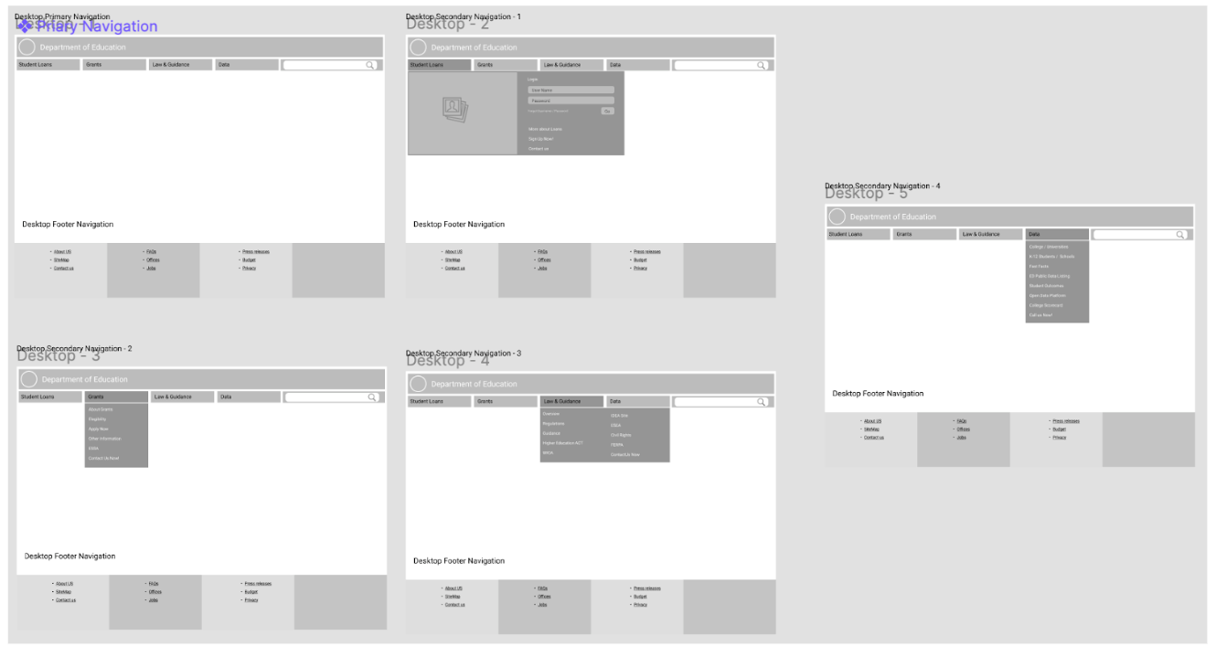
Homepage and Navigation redesign - Desktop
Homepage and Navigation redesign - Mobile
Five-second usability test result

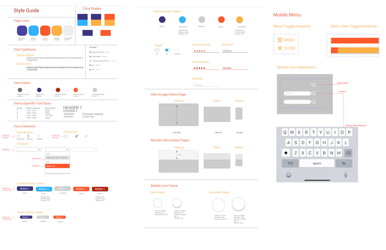
UI Style Tile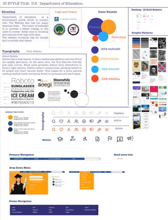
Style Guide
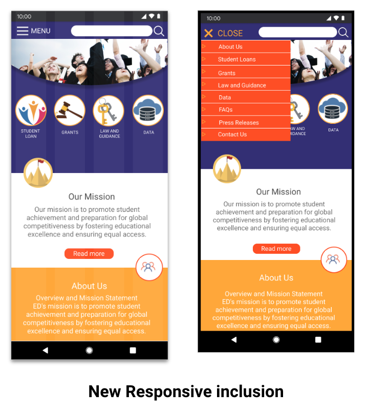
Mobile Homepage: Full design with Ui Style guide
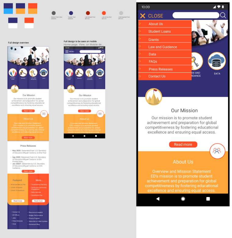
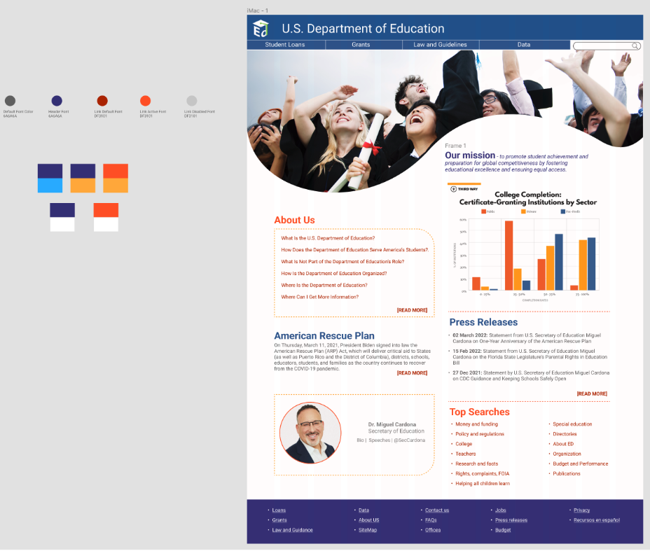
Desktop Homepage: Full design with Ui Style guide
Usability Test result 