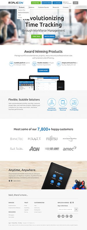
Website Redesign

Project Overview:Replicon Software is a leader in workforce management solutions, offering services that help organizations effectively manage their workforce, time, and expenses. The corporate website serves as a vital platform for communicating with clients, potential clients, and other stakeholders.
My Role:
- Director UX and Design: Responsible for the overall UX strategy, design improvements, and ensuring alignment with the brand's vision and values.
Heuristic Evaluation:
- Visibility of System Status:
- Ensure that users are aware of their current location within the website and can track their navigation progress.
- Match Between System and the Real World:
- Use language, terminology, and visuals that align with users' understanding of workforce management and time-tracking solutions.
- User Control and Freedom:
- Provide intuitive navigation with clear calls to action to enable users to explore the website at their own pace and backtrack when needed.
- Consistency and Standards:
- Maintain a uniform design language, including color schemes, typography, and navigation patterns, to establish a cohesive user experience.
- Error Prevention:
- Implement validation mechanisms in contact forms and registration processes to prevent user errors and frustration.
- Recognition Rather than Recall:
- Minimize the need for users to remember specific details by providing context and clear labels for actions and menu items.
- Flexibility and Efficiency of Use:
- Ensure that advanced users can efficiently access the information and resources they need, while also catering to users with varying levels of expertise.
- Aesthetic and Minimalist Design:
- Maintain a visually pleasing design that emphasizes the key value propositions of Replicon's services.
UX Design Principles:
- User-Centered Design:
- Prioritize the needs of Replicon's target audience, ensuring that the website's content and features are designed to fulfill their requirements.
- Responsive Design:
- Optimize the website to be accessible and visually appealing across a variety of devices and screen sizes.
- Consistency in Design:
- Maintain a consistent design language throughout the website, creating a unified and recognizable brand identity.
- Accessibility:
- Ensure that the website adheres to accessibility standards, making it inclusive and usable for all visitors.
- Content Hierarchy:
- Organize content with a clear hierarchy, emphasizing critical information about Replicon's solutions and services.
- Intuitive Navigation:
- Streamline navigation to make it easier for users to find the information and resources they seek, while also encouraging exploration.
Expected Results:
- An intuitive, user-centric corporate website that aligns with Replicon's values and resonates with its target audience.
- A responsive design that caters to users on various devices, enhancing accessibility and user engagement.
- Improved navigation, making it easier for visitors to explore Replicon's workforce management solutions and access critical resources.
- Increased brand consistency and recognition, reinforcing Replicon's position as a leader in its industry.
Conclusion:As the Director of UX and Design, the approach to enhancing the corporate website for Replicon Software combines heuristic evaluation methods with fundamental UX design principles. The expected outcome is a user-focused, responsive, and consistent website that offers a seamless user experience, reinforcing Replicon's status as a trusted provider of workforce management solutions. This initiative aligns with the company's vision of delivering superior value to its clients and stakeholders.